The Denver Zoo ticket purchasing flow is too long, frustrating, and doesn’t meet user expectations. I worked on researching and designing a new ticket flow prototype that solves the current issues and employs modern UX design conventions.
My Role
As an independent project, I was doing all roles during the project including research, prototyping, and conducting user testing interviews.
Challenge
The original ticket flow uses a lengthy and information-dense approach, and moving toward limiting that flow and information required researching which elements to keep, which to change, and which elements to remove. My task was to gather research to inform a new design of the Denver Zoo ticket flow and prototype low to high-fidelity interfaces.
Research
Conducting Usability Tests
Before starting the re-design, I focused on identifying the problems with the current flow by interviewing people while they went through the ticket flow. The users’ expectations were not met by the ticket flow, and they grew frustrated when they could not predict what pages or steps came next. Users were overwhelmed by the amount of information on each page, especially when it was irrelevant to their goal. I realized that by cutting down the experience to a modern conventional ticket flow, some of the issues would be solved.
Near the end of the flow, a user asked if they “[could] finally be taken to the debit card page”
One user said, “I think I get to checkout now,” they were wrong.
"It would be more stressful for people who are less adept with technology"
Analyzing Local Competitors
I also researched other ticketing systems used by tourists around Denver, like the art museum or nature and science museum, and uses a feature table to compare the sites. The nature and science museum had a shorter process and a simpler ticket bracket system, but generally, all of the competitors had similarly dense interfaces.
This research led me to three how-might-we statements:
• How might we give all the information that the users need without lengthening the ticket checkout process?
• How might we make the ticket selection and add-on process more efficient?
• How might we separate the redundant information for the different ticket reservation processes?

Design
Problem Statement
Zoo-goers need an easy way to identify which tickets they need to buy and buy those tickets because there’s a lot of information that slows down the process and causes annoyance
User Flow
The user flow is based on the simple, and most common action, of buying tickets. The user flow should be direct to avoid confusion and frustration, which the original flow had issues with. The simplified user flow places less importance on membership and donations, which may be antithetical to the Denver Zoo’s business model, but align with the users' wants.

Low Fidelity Wireframes
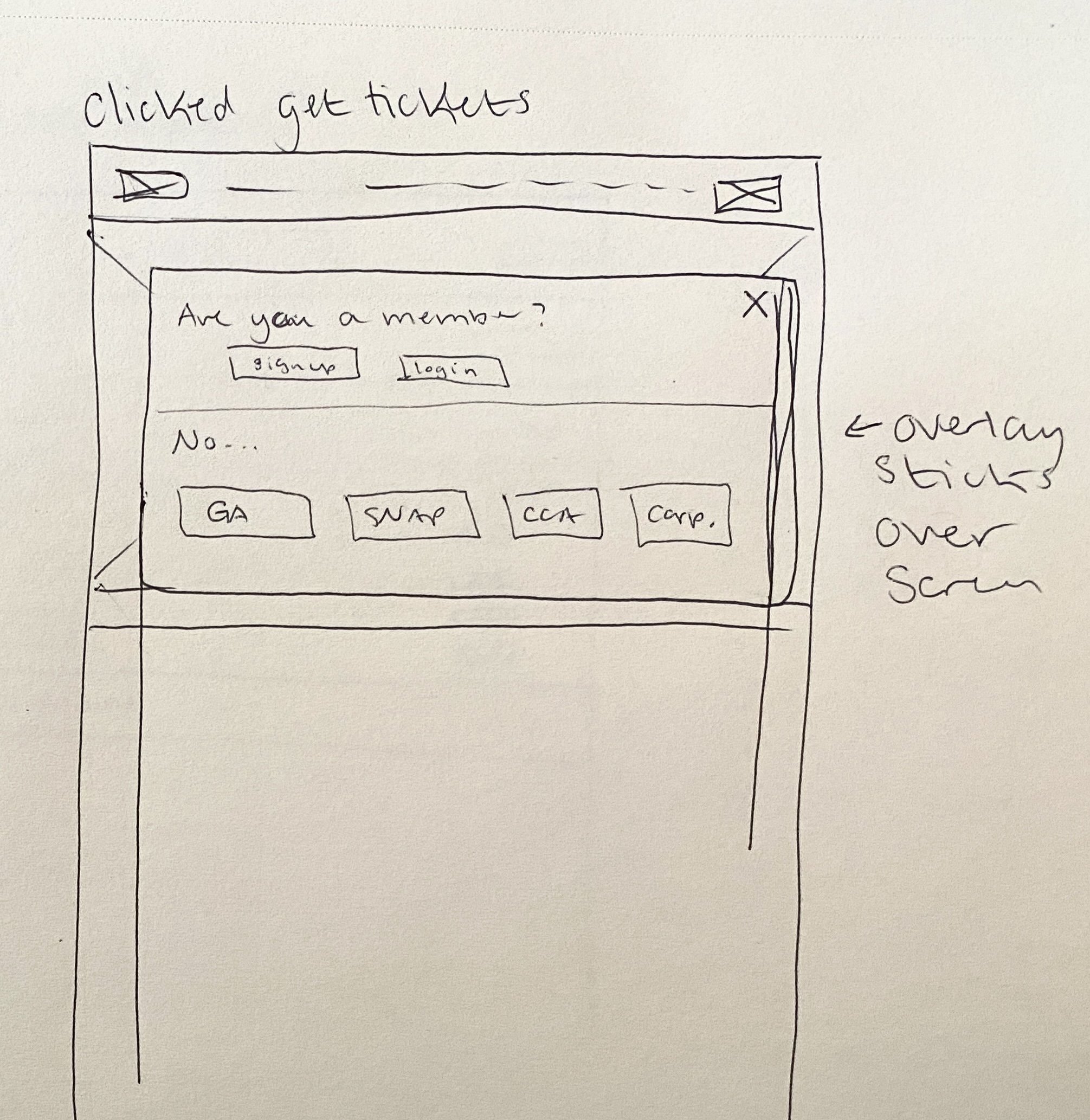
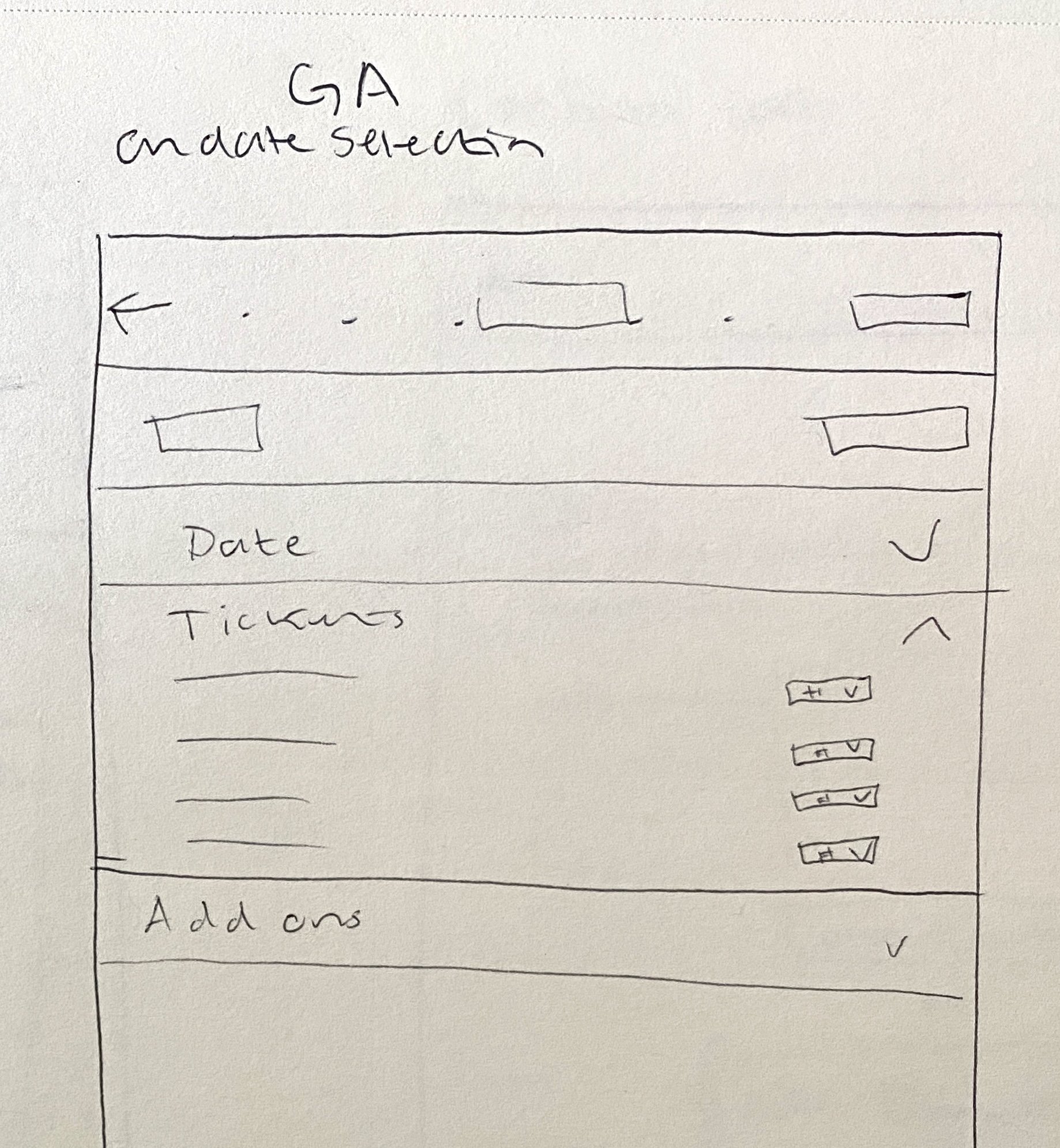
The low-fidelity wireframes lay out the page’s main information, calls to action, and user inputs, all items that are displayed in theory in the user flow. Due to the ease of iteration that the paper and pen format lends itself to, it’s the starting point of UI design and can reveal where there needs to be breaks in the page, separations of information, and ironing out the user flow. I tried playing around with having most of the ticket information on a single page but sectioning that page from top to bottom to signify the order of input.
Mid Fidelity Wireframes
With mid-fidelity wireframes, the placement of content and the organization of pages is solidified. This is where the app flow starts to become visualized more formally. I changed some aspects of my low-fidelity with feedback. I removed the boxes and lines that separated sections, to take advantage of the negative space. I also modified the general admission (GA) date selection to avoid a calendar modal and removed the images in the general admission (GA) ticket selection page for the add-on section.
High Fidelity Wireframes
After getting feedback on my mid-fidelity wireframes, I made a copy of the flow and started changing things around. I made sure to correct spacing vertically along the 8-point system, align fields and sections to the left, and use sentence case. Then I went in with a color palette, icons, and images to fill out placeholders. I also defined my components like primary, secondary, and tertiary buttons, and a text input field. To finish off the high-fidelity prototype, I linked the pages together using the Figma prototyping tool.
Feedback and usability tests
I gathered some feedback from a UX mentor and was able to tackle some areas that I had missed, like a footer and a confirmation page. I also received feedback on pulling the vertical spacing closer together and removing unnecessary buttons that have the same call to action or destination. I also changed some stylistic UI choices that seemed confusing from an external perspective, like using a border on some boxes that were also used on a button.

Before

After
I went to some peers and conducted a second round of user tests. Users were less confused and accurately predicted the call to action and destination of buttons. One of the users expressed confusion about the button labels, where there were a series of pages each with a “Checkout” button. Another friction point was the confusion of the add-on section, where they didn’t know the details of each item. Neither of them paid too much attention to the content of the home and visit pages, except for the Daily schedule, which they both thought was confusing that it didn't have today's date in there somewhere. Both users were able to grasp the concept of my ticket number, day, time, add-on selection process, and how that section progressed as the user filled in information or chose options.
I changed the labels of the confusing buttons to be more accurate about their destination. I also added a button in the add-on section that would open another browser window to the page of the Denver Zoo website that explains each add-on. On the home page, I changed the header "Daily schedule" to "Today's schedule" to indicate the date of the events.
Reflection
Future Plans
The next step would be to evaluate other user stories that would use this new ticketing flow, like how members would get tickets, or how users would add donations. Considering other user stories and user flows would mean building out more pages and frames from low to high fidelity, with more testing. If I had more time, I would implement all the pages of all ticket purchasing user stories to create a full prototype of the ticketing application.
Conclusion
Overall, the design process takes a lot of careful and researched steps. I learned a lot about considering user feedback, design conventions, and UX theory. Moving forward, I will be taking a more refined approach to designing flows and applications in order to practice the skills and theory learned while making this ticket flow.


